10 things I love at Tate Britain…
… and one that I just don’t understand – but we’ll get to that. The re-hang of Tate Britain is complete and unquestionably and unreservedly is a cause for celebration. The main circuit of the galleries is now a walk through 500 years of British art, arranged in a rigorous chronology, and then there are break-out spaces with smaller shows. The main perambulation will remain largely in place for a good while, but the ‘In focus’ exhibitions will change regularly. On the basis of a first visit last Saturday, when the galleries were pleasantly busy but a long way off the crammed conditions at Tate Modern, my sense is that the place and its art has never looked better, more enriching and more stimulating. Brava, director Penelope Curtis, and bravo head of displays Chris Stephens, and their many collaborators. There is much I want to post about, but I thought as an opener I would simply celebrate some things I admired and appreciated in just a small number of spaces – the galleries devoted to the 1940s, ’50s and ’60s as well as the two new Henry Moore rooms.
1. A major canvas by Richard Eurich
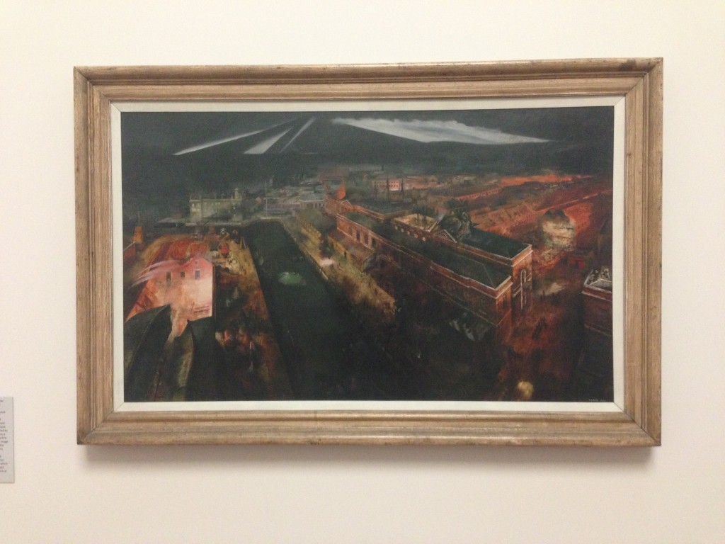
I have long been fascinated by the paintings of Richard Eurich who is conventionally pigeon-holed as a ‘war artist’. He was indeed an official war artist and this wonderful elevated view of an aerial attack is titled Night Raid on Portsmouth Docks, 1941 (artwork links in this post are to entries on Tate’s web site). Some of Eurich’s finest canvases were painted during World War Two but his work from both before 1939 and after 1945 is also well worth attention. Yet this is the first time I can remember seeing one of Eurich’s paintings displayed at Tate, and it was one of numerous pleasant surprises as I made my way round. For more on Eurich, see a rich website dedicated to the artist here.
2. Works by artists I have never heard of
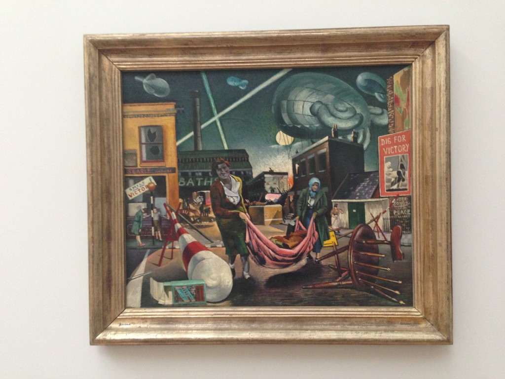
So this is Bombed Women and Searchlights, 1940 by Clive Branson. Who? Exactly. Among the many familiar masterpieces (and as others have commented the new hang is significantly more dense than before) are a number of works that attract your attention and make you ask that question. From Tate’s web site I learn that Branson was influenced by the Surrealists, showed with the Artists’ International Association and died on active service in Burma in 1944. I am extremely happy to have him, since Saturday, as a new acquaintance.
3. The revelations of chronology
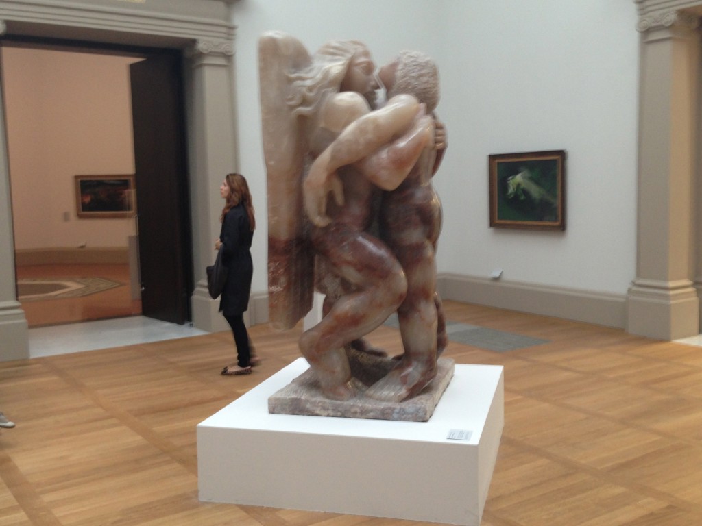
Jacob Epstein’s lumpen yet unutterably glorious Jacob and the Angel, 1940-41, hewn from glowing alabaster, is an old friend. But because it is now in the centre of a gallery devoted to art of the 1940s it takes on meanings that had never occurred to me before. Yes, it has all of the religious connotations detailed in Tate’s web catalogue entry, but here it also looks like a monument to the spirit of an exhausted British people being sustained for one final attempt to take the fight back to the Nazis.
4. John Read alongside Henry Moore
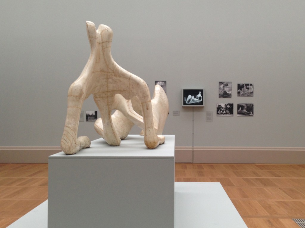
The new hang has two substantial spaces devoted to the work of Mr Moore. These are busy spaces, with sculptures and drawings and contextual photographs and texts vying for your attention. But by and large the works look great (do we think the grey of the walls is just a bit too much?) and I was simply thrilled to see that an extract of John Read’s 1951 BBC film Henry Moore is being shown on a loop alongside one variant of the work whose making it chronicles, Reclining Figure, 1951. On this blog and elsewhere I have long championed the importance of this documentary and its display next to one of Moore’s greatest works is an exemplary demonstration of the way in which film can illuminate a work of art. For those of us who knew John Read it also feels like some sort of recompense for the lack of respect that too often his employer and the wider culture showed towards him during his later years.
5. Seeing familiar things in new ways
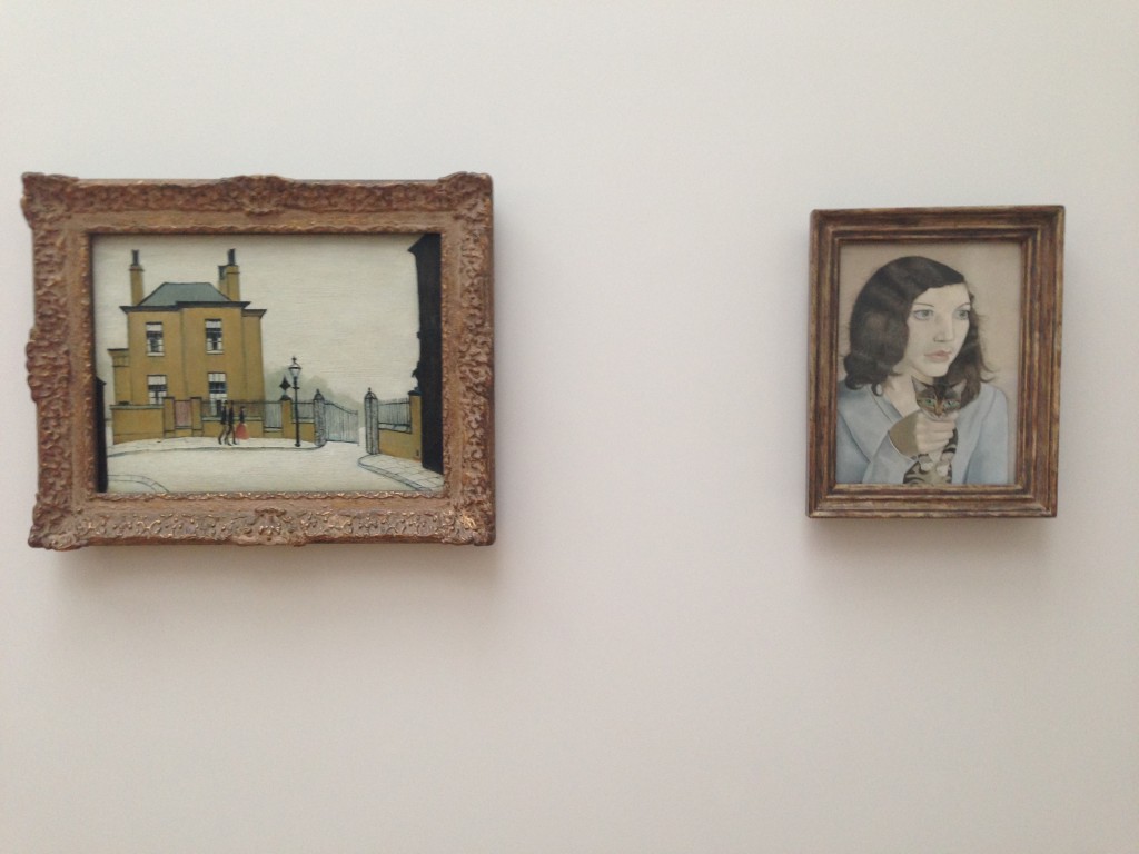
I could have picked numerous examples, but the juxtaposition of L.S. Lowry’s The Old House, Grove Street, Salford, 1948 with Lucian Freud’s Girl with a Kitten of a year earlier seems particularly felicitous. Here is one of the most reviled modern British artists (at least by some, although Tate Briain’s major show this summer change that) hung next to the most revered – and the similarities are at least as revealing as the differences.
6. Henry Moore everywhere
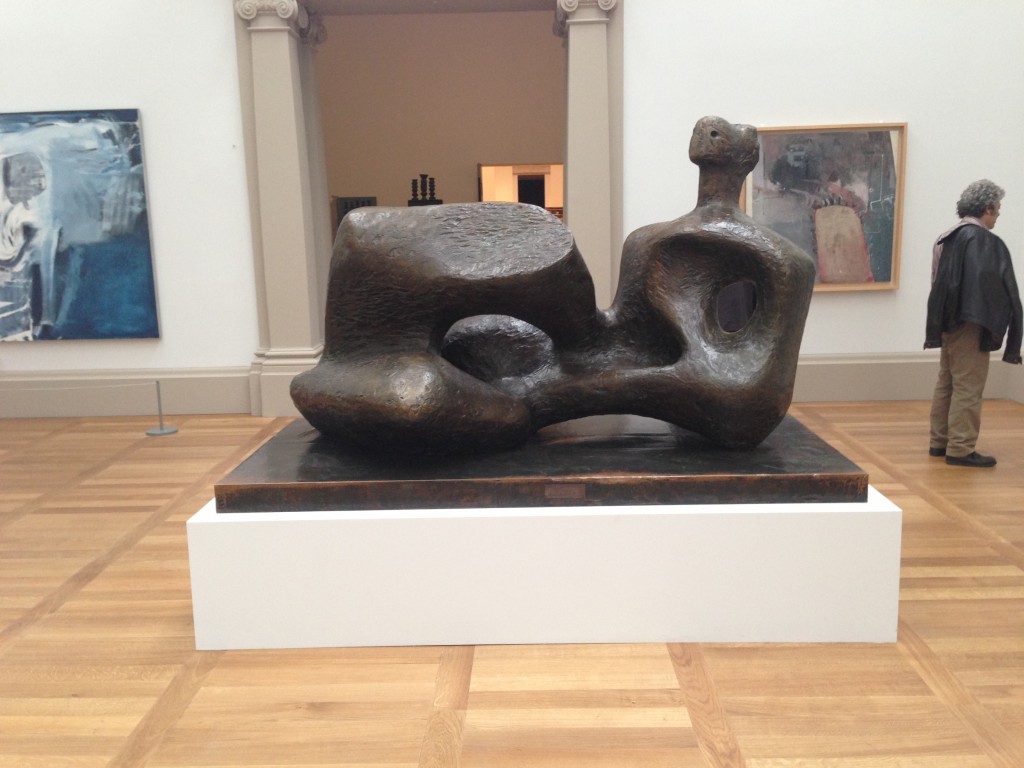
Although there are two Henry Moore rooms, the artist’s works are also present in several other spaces, and in each place they more than justify their presence. Here is Working Model for UNESCO Reclining Figure, 1957, anchoring a 1950s gallery that is full of wondrous things…
7. Beautiful juxtapositions, part one
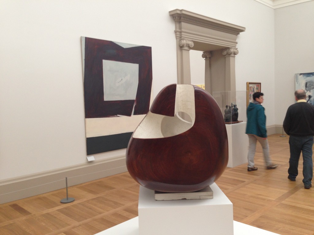
… and these are two of them: Barbara Hepworth’s guarea wood Corinthos, 1954-55, echoed by Robyn Denny’s rarely-seen canvas Home from Home, 1959.
8. Beautiful juxtapositions, part two
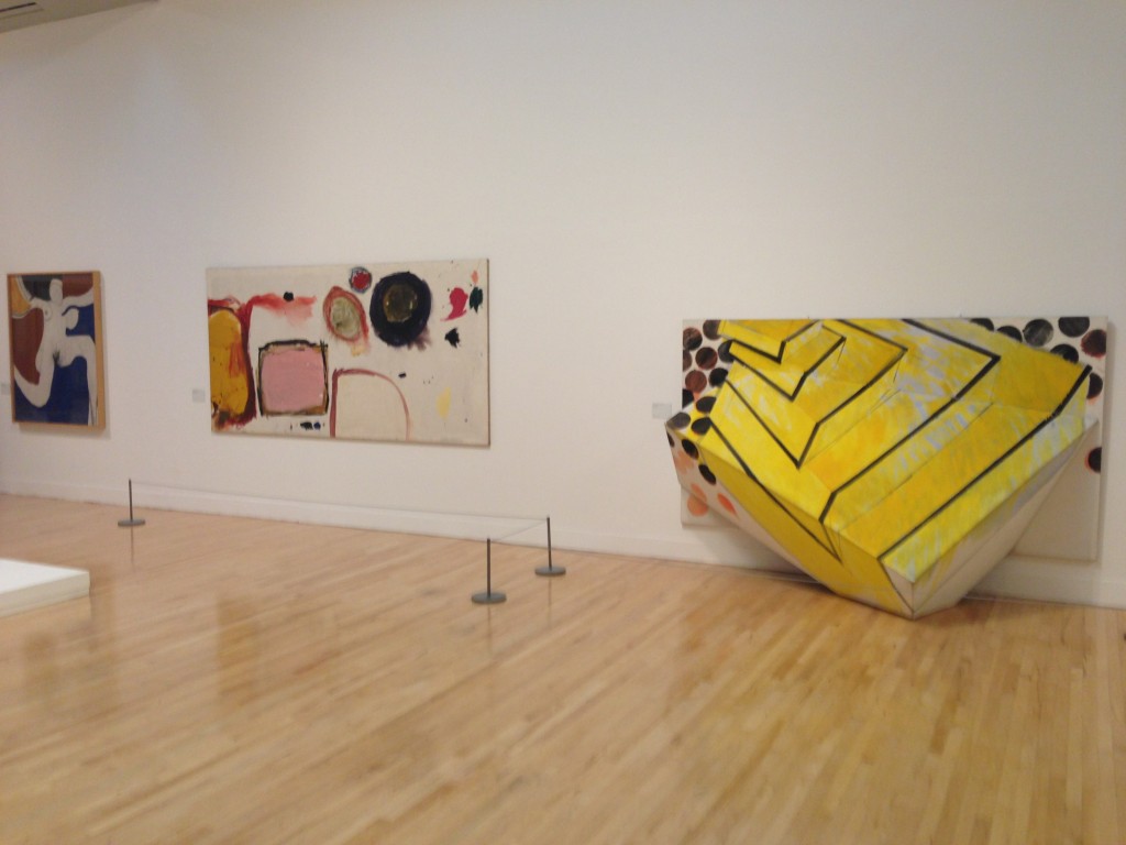
Next door, in the 1960s gallery, there is a wall on which is displayed (from left to right) Roger Hilton’s Oi Yoi Yoi, 1963, Gillian Ayres’ Break-off, 1961 and Richard Smith’s Piano, 1963. More conventional hangs would never have aligned these works but they make a defiantly handsome trio with ideas about paint and shape and colour, and about the boundaries of figuration, sparking between them.
9. Wonderful new acquisitions
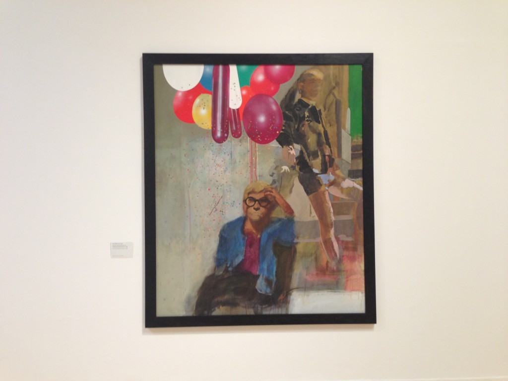
This is Peter Blake’s Portrait of David Hockney in a Hollywood Spanish Interior, 1965. I see from the label that Hockney presented it to Tate in 2002 but I don’t recall having seen it before. It is a a quite exceptionally good and perhaps even great painting.
10. A photography policy that allows us all to take photos
The guard who I spoke with explained with pleasure that as long as I did not use flash it was fine to take photographs. This is simply brilliant – and exactly what I would hope for from our national collection of British art.
Now for the thing I just don’t understand.
Jonathan Jones in the Guardian among others has commented on Tate’s decision to do away with explanatory labels next to the works of art. Gone indeed are the comforting wall panels summing up in 200 agonised-over words the connections between works of art in a room. Gone too are the too-often-simplistic pointers to an artwork’s meaning which too often came across as prescriptive and determining. Excellent.
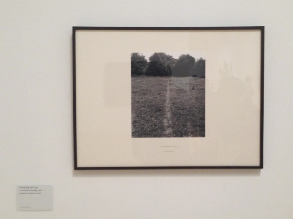
But then this is Richard Long’s A Line Made by Walking, 1967, not it must be said the easiest of works to approach…
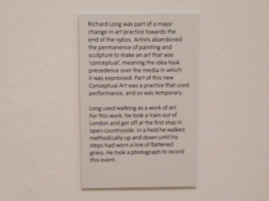
… and on the wall right beside it is this:
Say what? Is this a case of one rule for the ‘difficult’ pieces, which need a caption, and one for the rest of the art, which is graced by the absence of text? Looking around, maybe 1 in 10 works is accompanied by a similar caption, although I could find neither rhyme nor reason for which ones attracted them and which did not. And that’s what I failed to understand on Saturday. But in general Tate Britain is now as great as I can remember it in the forty-two years (since the Eduardo Paolozzi retospective in 1971) during which I have been a regular visitor.
Lead image: Sir Henry Tate, exhibited 1898, by Thomas Brock at the start of the BP Walk Through British Art at Tate Britain.
Leave a Reply