Remembering David King

I think I met the great graphic designer David King, who has died, just once. Yet he shaped my visual imagination and gave form to the fight that defined my first years as a writer. I think I said hello to him when he came to the Islington offices of City Limits in the autumn of 1981. City Limits was the weekly guide that the majority of the staff of Time Out set up after a bitter dispute earlier that year. We were protecting the principle that everyone on the magazine, from receptionist to editor, was paid the same salary. Strange as this may seem, it felt important to us then, and it remains important to me, even if now it seems more utopian than realisable. But it had been achieved and, in the face of opposition from Time Out‘s owner, we were determined to keep it alive. So we begged and borrowed enough money to start a rival and asked David King to design it for us.

This was the cover of the launch issue – a later cover is featured above, along with one of David King’s covers for Crafts magazine. I can still recall how proud we were when advance copies arrived. And looking at it now brings back the 20 weeks we spent protesting against Time Out‘s management and bringing out a weekly newssheet with listings for the art cinemas, fringe theatres and more that had pretty much depended on Time Out for their audiences. Initially we had called this Not Time Out (following the model of the popular television comedy Not the Nine O’Clock News), until an injunction forced us to cease and desist using “Time Out”. And in the bold blue star of David King’s cover you can see the trace of this bitter dispute.
There is a fascinating and revealing interview with David King conducted by Christopher Williams for Eye magazine in 2003, in which he reflects on designing for City Limits during its first year and creating the visual style for the Left in the late 1970s:
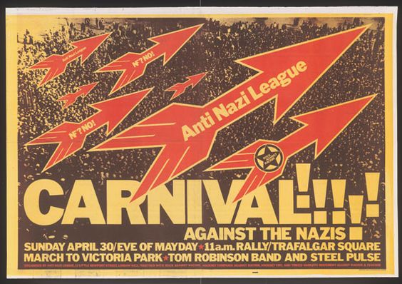
DK: Okay. Before the anti-apartheid and anti-Nazi material, there wasn’t a visual style on the Left – it was a mish-mash. [Robin] Fior and [Richard] Hollis did some marvellous posters, but there was no visual statement position over a wide area like they did it in Russia. We contributed to doing that.
CW: Were you consciously trying to create a visual style for the Left?
DK: Absolutely.
CW: But as soon as you create a style for a political stance, then it becomes easier to disregard.
DK: In my experience, the creating of a specific visual style for that ethos went a long way toward putting it on the map in the first place. The Left is still using it, strangely enough.
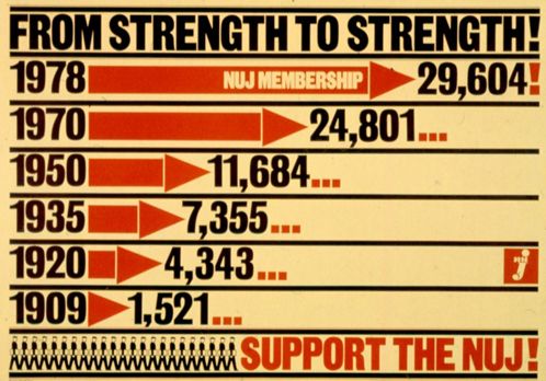
Others have written David King’s obituary, including The New York Times with David King, 73, dies; graphic designer amassed trove of Soviet political art. There is a great Pinterest board of his varied but always highly distinctive work, including Anti-Nazi League posters, catalogues for Oxford’s Museum of Modern Art under David Elliott (of which I have several much-prized examples), book covers for Penguin, Cape and many others, layouts for The Sunday Times Magazine and print elements fighting apartheid and promoting the National Union of Journalists.


Mike Dempsey profiled David King for Design Week back in 2001, and he has posted an updated version of this on his blog. It’s a great read, and a reminder of a different (and largely lost) world of visual imagination, of Leftist politics, and of the close links between the two. Dempsey sums up King’s style like this:
His work is uncompromisingly direct, often employing wood block type, primary colours and a dynamic juxtaposition of type to image. It hits you like a ‘Wanted’ poster… He makes no secret of his love of the Russian Revolutionary designer Gustav Klutsis and the German Dadaist and political collagist John Heartfield.
The article also outlines David King’s life-long fascination with the Soviet era, which resulted is an unrivalled collection of posters, photographs and print materials. Working with this King published a number of important books, including The Commissar Vanishes and Red Star Over Russia: A Visual History of the Soviet Union From 1917 To The Death Of Stalin, and presented exhibitions at Tate Modern and elsewhere.

David North has also written a punchy and delightful profile of David King for World Socialist Web Site, and he quotes the designer from the introduction to Red Star Over Russia:
Even as a child I detested capitalism. I thought it was unfair. I also loathed religion and the monarchy. I found the clothes they dressed up in sinister and frightening. When my uncle, who was a socialist, taught me about the true nature of the ruling class I agreed with him that it clearly had to be overthrown. I used to dream, like all children, how life would be in the 21st century. If anyone had told me that there would still be inequality, racism, kings, queens and religious maniacs stalking the planet I would have considered them crazy.
Although I only met David King the once, I am sad at his passing.
Richard Hollis’ very good Guardian obituary of David King is now here:
https://www.theguardian.com/artanddesign/2016/may/25/david-king-obituary