Making ‘Drama…’, 4. The Graphics
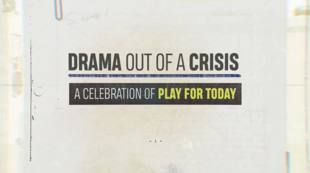
John Wyver writes: With transmission on Monday evening (9pm, BBC Four, in case you’re in any doubt) hurtling towards us I’m returning to this series of posts reflecting on the production process of our documentary about Play for Today, Drama Out of a Crisis. I’ve already considered aspects of Starting Out, The Interviews and The Archive, and here I want to explore the distinctive graphics of the programme.
From the very beginning, I knew that the film needed an overall graphic design. In part, I simply enjoy sophisticated screen graphics and I think they can add immeasurably to a film. Too often, however, they seem as if they were one of the last elements to be considered, once almost everything else was in place. I was determined that would not be the case on this project.
Challenges
I wanted an overall design that would contribute to situating the archive and the issues in a specific historical moment, and help bring together the drama with the political and social world of the 1970s as well as with the production context in which the plays and films of the series were made. At the same time, there were a number of practical issues to be addressed. We have used a very wide range of archive elements, and all of the major ones needed to be identified – and ideally not with just a title and date but also with (at minimum) a writer and director.
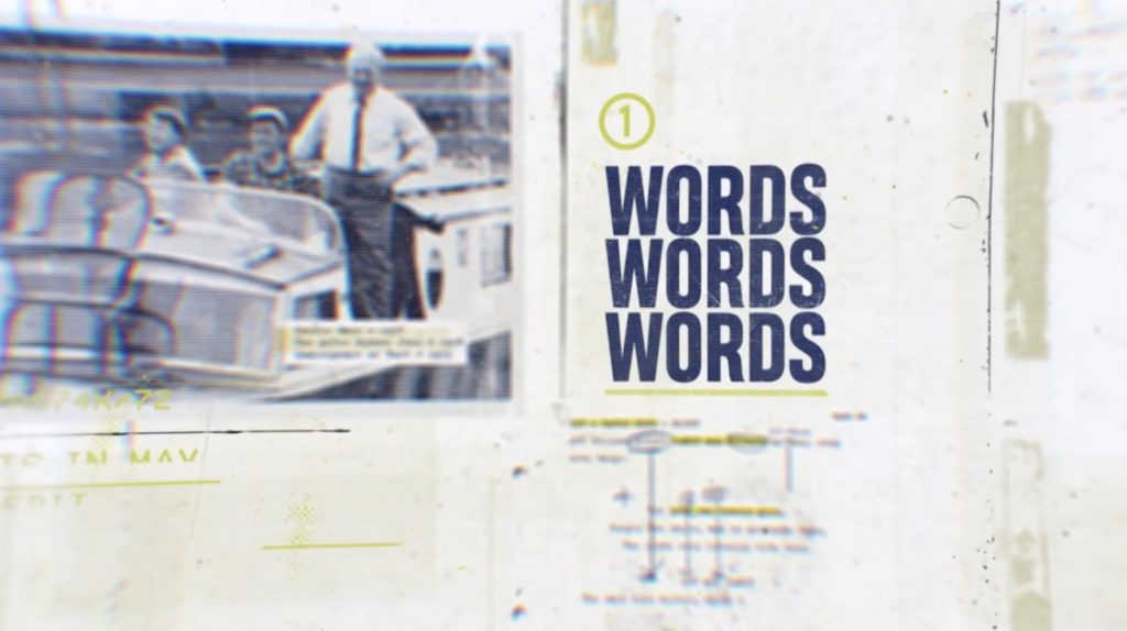
From the beginning I had conceived the film as being structured in chapters, and it was clear that we would need headings of some kind for each section – the final result for ‘Words, words, words’ is above. It also seemed likely that the opening would graphics-heavy to try to get across certain basic facts about the series as well as the breadth of the commissions and the extraordinary range of contributors both before and behind the cameras.
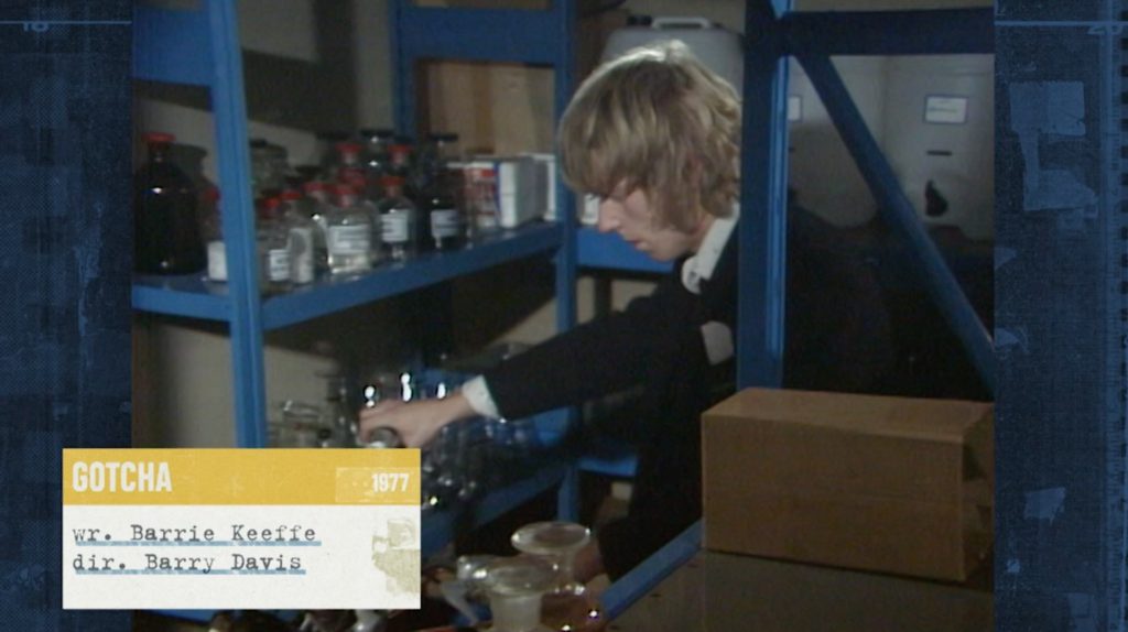
Perhaps most crucial of all, we needed a solution for the question of how archive and other elements would be presented within the frame of the documentary. Part of this related to situating in a contemporary widescreen frame with a 16:9 ratio archival moving images, most especially from the plays themselves, which had been shot with a 4:3 ratio.
It was unthinkable to adopt the thoughtless, barbaric (I don’t use the word lightly) but all-too-common approach of slicing off the top and bottom of archive sequences to make them fill the 16:9 frame. But retaining the integrity of the historical images and running them at full height (often called the ‘pillar box’ solution) meant that we would have blank spaces on either side. Many documentaries simply leave these spaces blank and black, but I wanted something more deliberate and elegant.
Editor Todd MacDonald and I also knew from early on that we wanted to employ split-screen techniques for the presentation of the archive, and this too meant that there would be blank areas in different configurations around paired sequences and around those in which three, four or even more channels of video were running.
Solutions
To collaborate on finding solutions for all of this, at the start of the edit Todd and I turned to graphic designer Ian Cross with whom we worked on a 2014 series for Sky Arts, Anarchy in Manchester. For Anarchy…, which showcased great Granada archive of early punk, Ian created a palette of elements that referenced the graphic style of early punk, and you can get a sense of that from this trailer.
Over around two months of intensive – and for Todd and I, immensely productive – collaboration, Ian developed solutions to all of the problems outlined above, establishing a vital coherence for the film, contributing individual elements of great elegance and complexity, and ultimately making it look – in my humble opinion – simply great.
We started with mood boards culled from Pinterest and elsewhere of graphic elements from the 1960s and ’70s – book covers, especially Penguins, were one important reference, along with record sleeves, posters and other traces of the time. ‘Pop’ graphics from the ’60s were seductive but ultimately felt too bold, and we recognised we needed something a touch less confident and upbeat.
We also drew on the distinctive Play for Today title sequences, of which there were seven in all, each with individual styles and typography (and you can see all of them at some point in the finished film). Perhaps the best-remembered ‘graphic’ technique from the titles is the rhythmic cutting into and out from details of production photographs which can be seen in this fragment below from a 1975 production. We haven’t replicated this technique in the documentary but it was a key influence on the wonderfully detailed opening sequence.
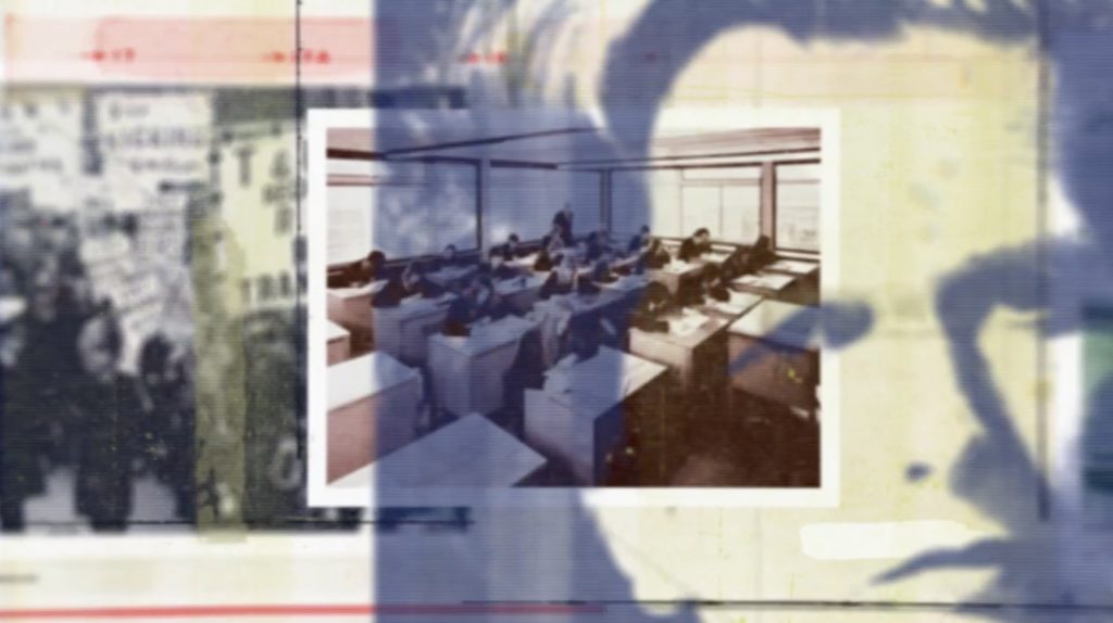
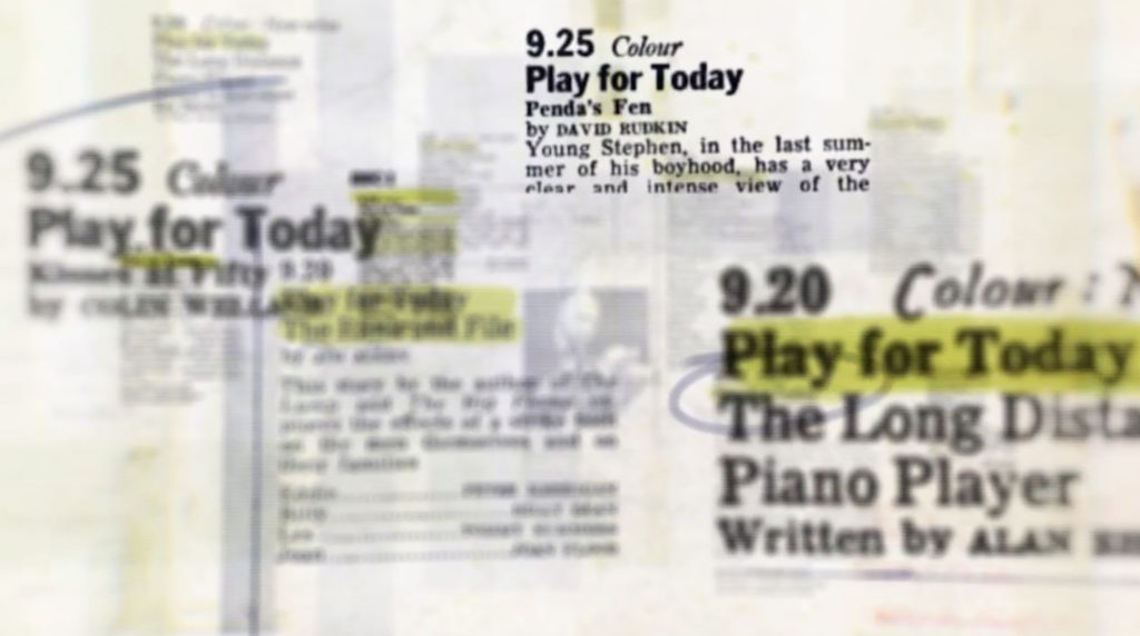
Just as important to the mix was a whole range of printed materials related to the original series: scripts and production paperwork, publicity materials, and Radio Times features and billings. Again, as these screengrabs show, all of these feature in Ian’s layerings and composites and animated scribblings in the opening three minutes and also fed into the chapter headings.
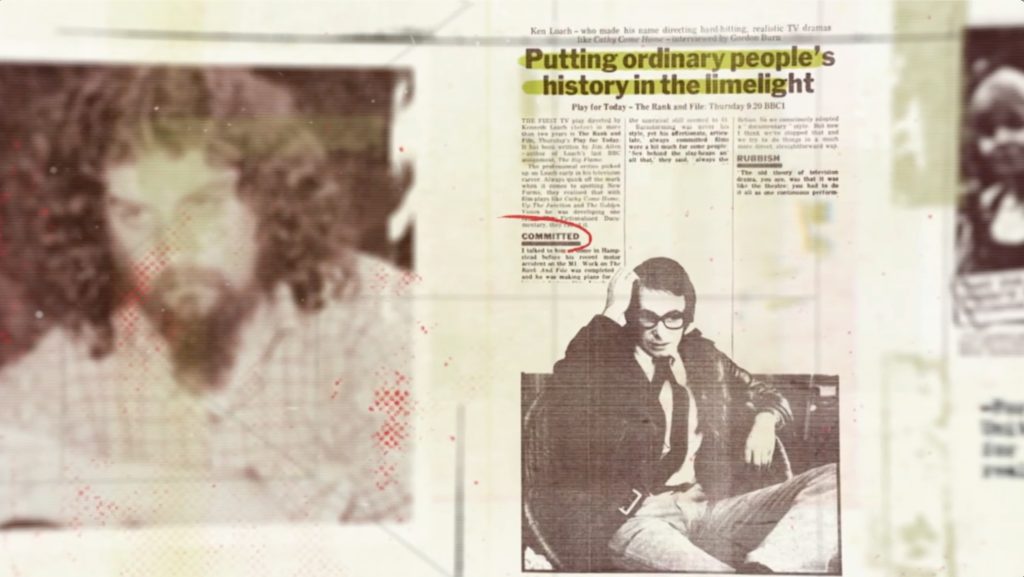
The script as central
Indeed, the idea of the script as the originary element of every Play for Today became centrally important, with page layouts, punched holes, tape marks and paperclips as structuring elements, along with a typewriter typeface for caption lines identifying writers and directors on extracts and contributing a selection of credits for each interviewee. One other crucial component was the materiality of both filmmaking and recording to videotape, so that throughout we have used film ‘flashes’, image break-ups, edge numbers from film prints and the like.
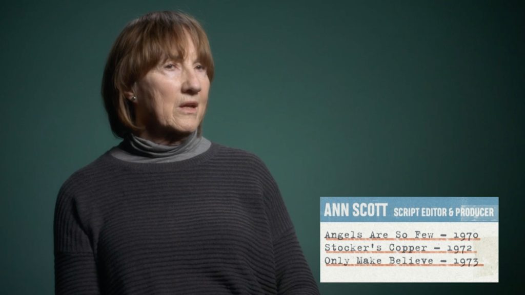
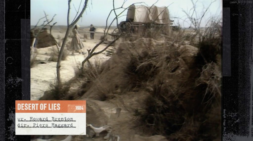
Ian drew on all of this and in frequent exchanges with Todd and I developed and refined each item, and then refined them again, and once, twice, more. The process was an exemplary collaboration and the results have, for me, a depth and a detailing that is thrilling and that repays re-viewing (and believe me, I watched them a lot).
Perhaps most successful are what we came to call the ‘textures’ within which the archival elements are sited. These mix script elements with abstract patterns and utilise a range of colours, mostly dark and unobtrusive but just occasionally bright and brash, that are often cued by a tone within the moving image. Most of the time they are not there to be noticed but again they contribute immensely to the coherence and what I think of as the deliberateness of each element of the documentary.
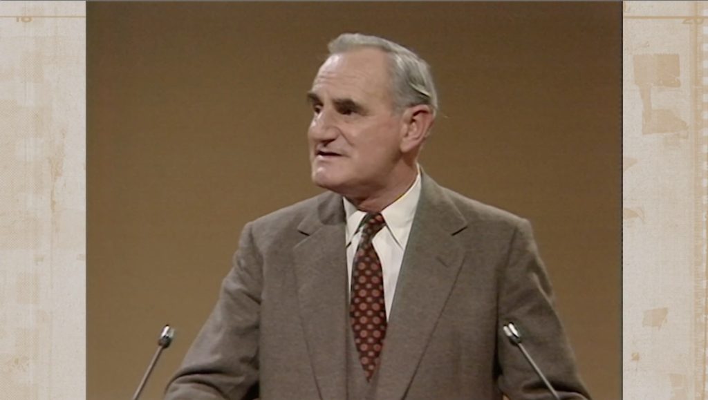
One idea that we tried out but ultimately abandoned was captions for the archive that identified the main actors in a particular sequence. There is, for example, a fragment of The Imitation Game (1980), written by Ian McEwan and directed by Richard Eyre, that is centred on a luminous performance by Harriet Walter in one of her first major roles. We tried complementing this with the caption ‘Cathy: Harriet Walter’. In one way it enhanced the interest of the clip but it also felt potentially distracting, and there was also the problem of deciding which clips and which actors to highlight in this way. Ultimately we abandoned the idea.
And there was an element that we simply ran out of time to implement in the way that we intended, which was to make use of moving templates and backgrounds for the display of the extracts. But what this gives us is a component to experiment further with when Todd, Ian and I work together on a future archive-based commission in early 2021…
As for the graphics that we did achieve, we would love to get some reactions to what people feel works as well as what perhaps does not. So do please feel free to use the Comments facility below to record your thoughts, both positive and – politely, please – negative.
The (tactile, expansive) sensation that the graphics reminded me of (subconsciously, until reading your article made me think about it) was of having a desk at the BBC Writen Archives, opening up boxes and folders, and carefully laying out typewritten documents, blueprints, production stills etc., in front of me.
“Moving templates and backgrounds for the display of the extracts” generally have a mild motion sickness effect on this viewer! The coloured textures that you use work well enough by themselves to avert the offputtingly austere impression that the black bars might give off.
There are two interesting comments on FB in response to this post, and I’m re-posting them here to develop this conversation further – thanks to Tom and Ian, and also to Billy for the thoughts above.
Tom May:
The graphics used in the sides of the image when there are clips look great. Unobtrusive and enhancing, especially the Gotcha one, but all of them really! It ought to become standard practice: treating archival material with respect and presenting it in such a diligent way.
Ian Greaves:
Forgive me for not saying this sooner in feedback, because I felt it all along, but what I really liked about this particular framing of 4:3 archive was how it was reminiscent of a film cutter. Even when matched to VT material, it spoke to the tactility of television apparatus which you and Todd developed across the piece.